Landing Page Experience – Lead Design at Tammwe
Redesigning Tammwe: Driving 51% More Leads Through UX-Focused Web Transformation
Role
Product Designer
Deliverables
User research insights, revised information architecture, wireframes, responsive UI design, interactive prototypes, live Framer build, and post-launch analytics reports.
Team
Product designer (UX/UI) collaborating with the marketing lead, content strategist, and product manager — end-to-end design and build executed in Framer.
Duration
8 Weeks
Project Overview
Tammwe is a B2B SaaS platform that helps organisations, from startups to enterprises, scale their teams by providing vetted tech specialists on demand. Originally launched in 2024 to support freelancers and small client collaborations, the product has since evolved to serve a broader enterprise market. It offers workforce flexibility through contract-based talent, making it easier for companies to fill skill gaps quickly and efficiently. However, the marketing website had not kept pace with modern UX standards or mobile performance expectations. As key performance metrics began to plateau, particularly lead conversion, bounce rates, and mobile engagement, stakeholders identified a clear need for a strategic redesign. Our objective was to rethink Tammwe’s marketing presence from the ground up and align it with its new B2B positioning and growth goals. The goal was twofold:
Modernise the user experience to align with updated brand positioning.
Create a frictionless path for potential customers to learn, trust, and convert. The project spanned 8 weeks, covering user research, IA overhaul, design systems update, and post-launch analytics tracking.
Visit the site here
The Problem
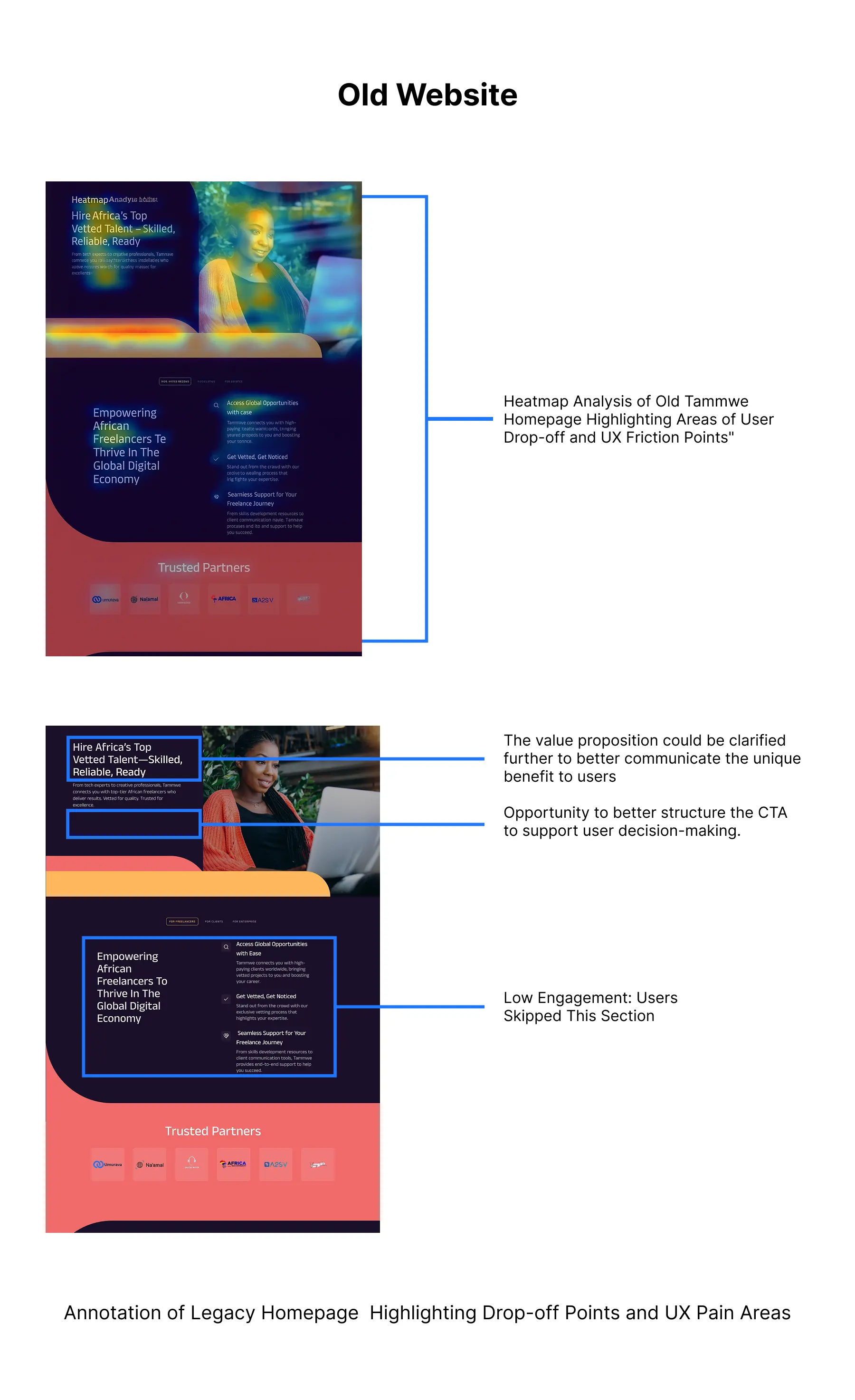
The original website had a confusing structure, long load times, inconsistent branding, and lacked clarity in how the product solved business pain points. These issues led to low engagement and poor lead generation, especially on mobile.
Key Issues Identified:
Bounce rate above 65%, especially on mobile
Average time on site under 1:00 minutes
No clear CTA hierarchy or value proposition
Users are confused between product features and company mission
Inconsistent UI patterns across pages
Mobile responsiveness issues on key form pages
Contact forms buried in sub-navigation
Research & Discovery
I took a data-informed and user-centred approach to understand the scope and depth of the problems.
Tools & Activities:
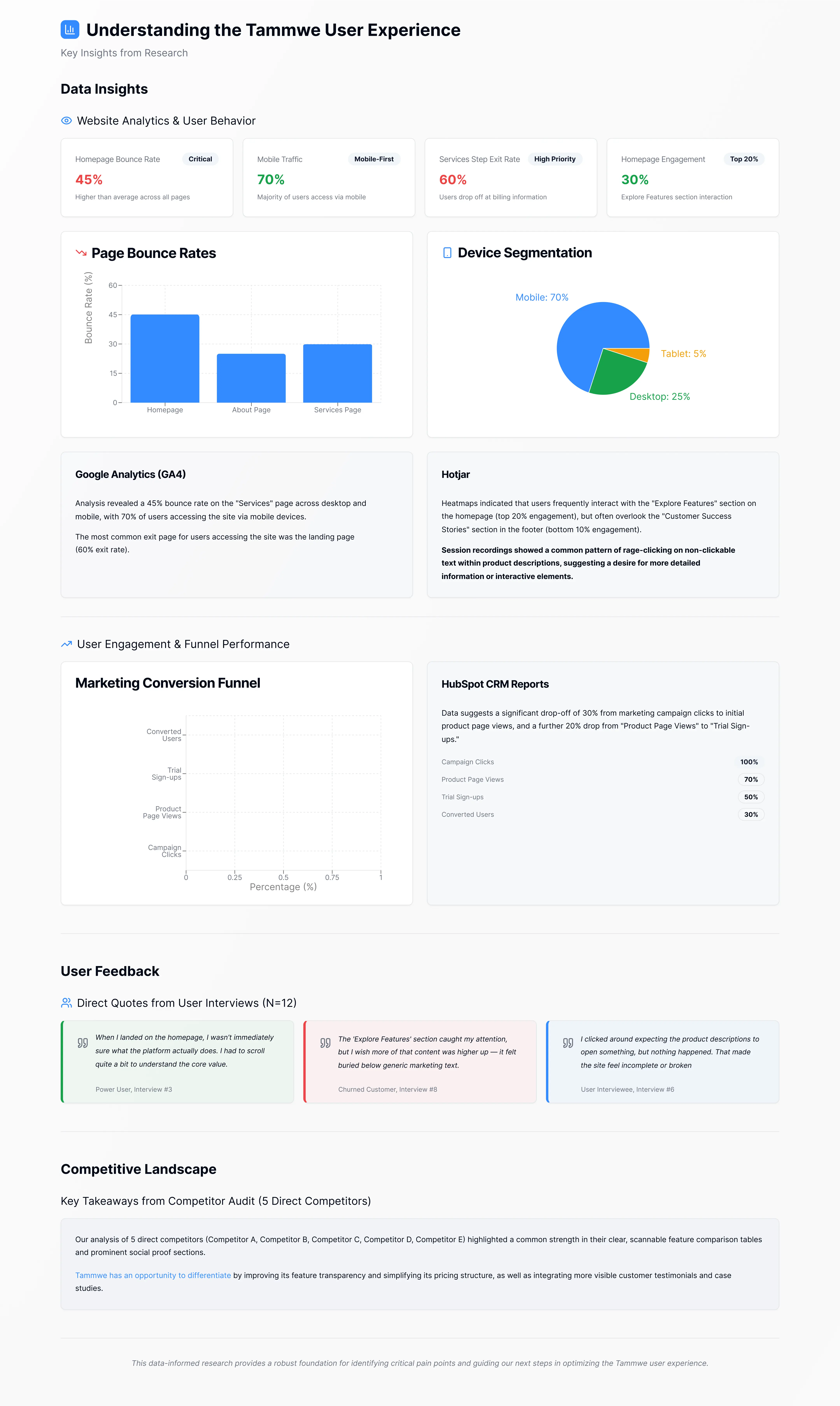
Hotjar: heatmaps, scroll maps, and user recordings helped identify which elements users ignored or rage-clicked.
Google Analytics (GA4): gave us device segmentation, exit pages, and user journey flow.
HubSpot CRM Reports: helped us pinpoint marketing funnel drop-offs from campaigns to the website.
User Interviews: conducted 12 interviews with power users and churned customers.
Competitor Audit: We benchmarked 5 direct competitors for navigation, tone, and page hierarchy.
UX Goals & KPIs
Based on findings and stakeholder alignment, we defined measurable success metrics:
Reduce overall bounce rate by 25%
Increase lead form submissions by 40%
Improve average session duration by 30%
Raise mobile conversion rate by 20%
Simplify navigation to reduce support requests by 50%

Stakeholder Workshops & Early UX Explorations
I led cross-functional ideation workshops to spark collaborative thinking around layout concepts and feature prioritisation. By introducing early wireframes, I ensured alignment on UI direction across teams before we moved into visual design.
Key Concepts Explored:
Above-the-fold product storytelling
One-click access to demo request
Content chunking with visual hierarchy
Trust-building via testimonials, use cases, and logos
Persistent CTA on every section
Information Architecture
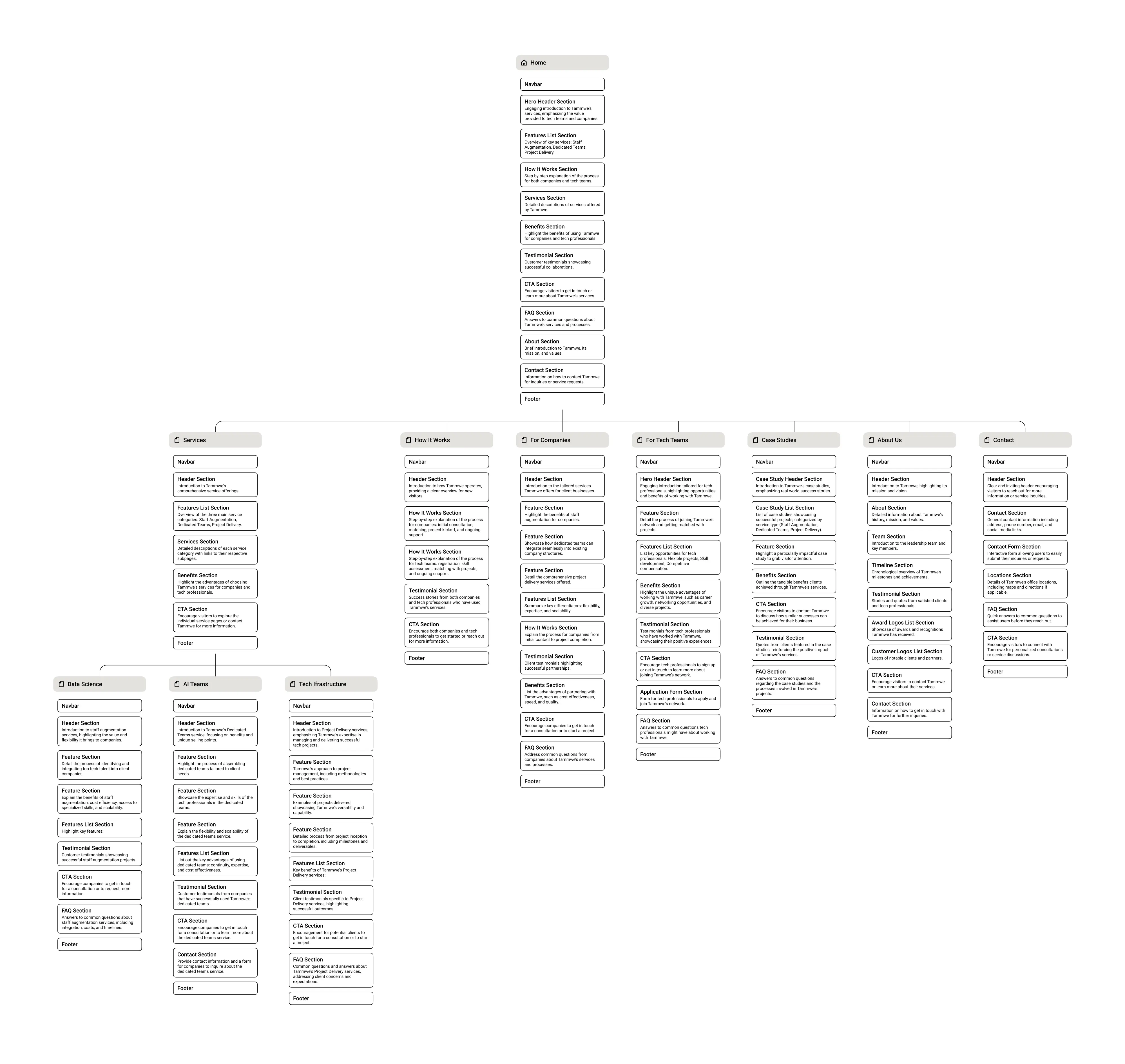
I restructured the site map based on insights from card sorting exercises, user analytics, and key business goals. By streamlining the experience from 18 pages down to 9 focused core pages, I reduced content sprawl and helped minimise user decision fatigue.
Key IA Changes:
Removed underperforming pages
Reorganised navigation to reflect user needs: Services, How it Works, Case Studies, About, Contact
Introduced "What we do" section with interactive comparison table
Added fixed nav bar with persistent CTA
Simplified footer with quick access links and contact
The Solution
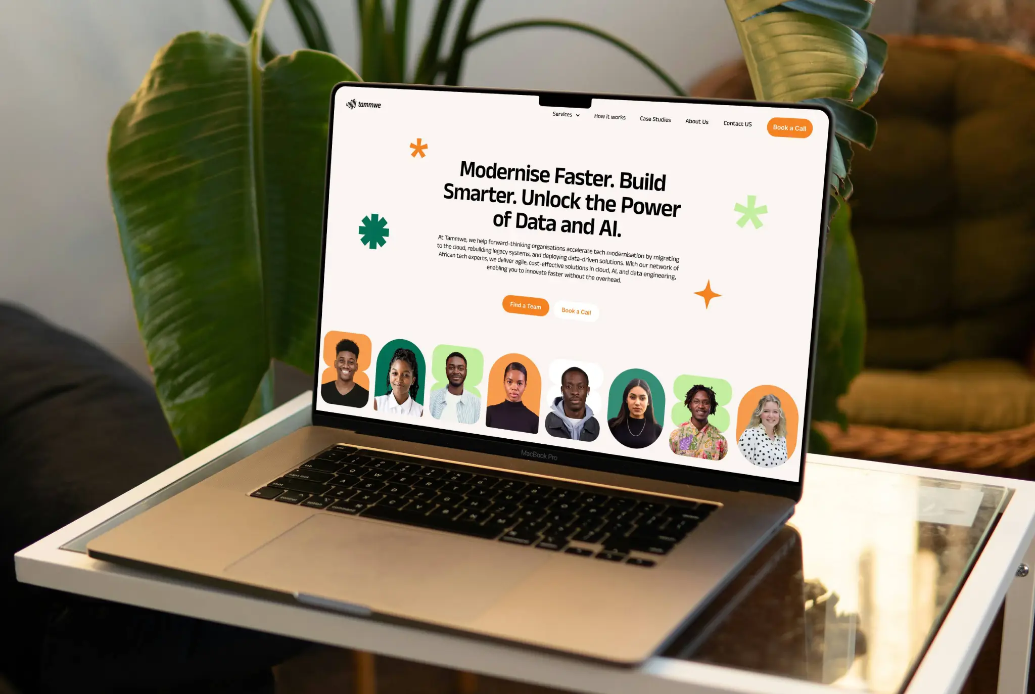
I led the implementation of a responsive, conversion-focused redesign that clarified Tammwe’s value proposition and drove user action. By leveraging white space, strong visual hierarchy, clear CTAs, and social proof, I crafted an experience that felt both intuitive and persuasive.
Key UX Enhancements:
Redesigned homepage with dynamic value proposition and scroll-based storytelling
Consistent component library for UI across the site
Mobile-first design with priority CTAs and simplified nav
Improved loading performance with optimised assets
Integrated HubSpot forms with autofill and tracking
Added testimonial carousel and logos above the fold

Visit the site here
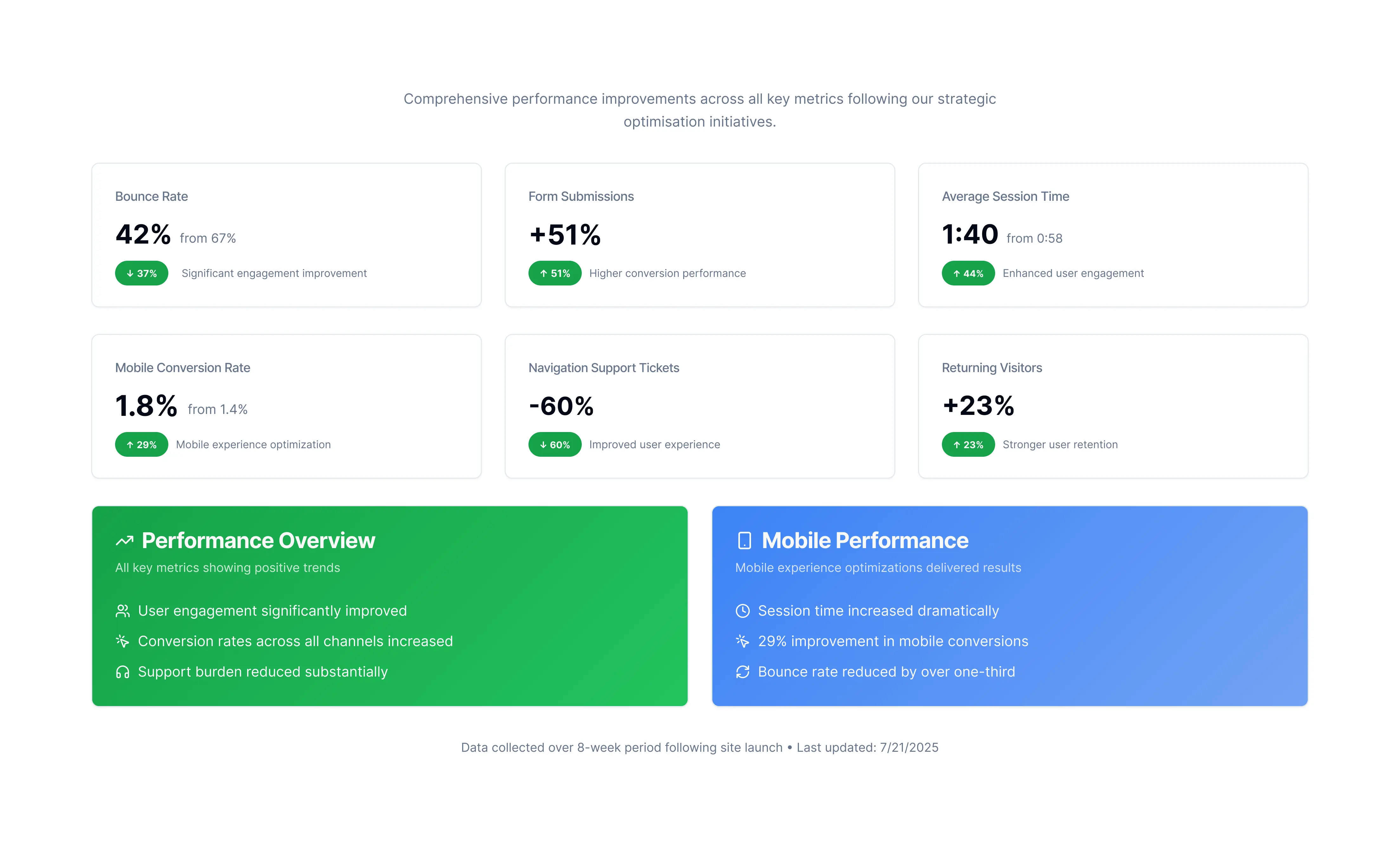
Results & Metrics Achieved
Within 8 weeks of launching the redesigned site, I tracked and reported measurable improvements across key performance indicators, validating the effectiveness of our design decisions.
Key Metrics:
Conclusion
The Tammwe redesign project transformed the website into a performance-driven, user-centred experience that closely aligns with the company’s evolving business goals. Grounded in user research and built through close collaboration with marketing and engineering, the new site delivers measurable impact by improving usability, clarity, and conversion potential.
A key takeaway from the process was the value of early-stage testing. I introduced interactive Framer prototypes and facilitated structured stakeholder reviews, which significantly streamlined decision-making and helped bridge the gap between design and development, reducing back-and-forth and accelerating alignment across teams.
This redesign not only modernised Tammwe’s digital presence but also laid a scalable foundation for future growth while keeping users at the heart of every design decision.